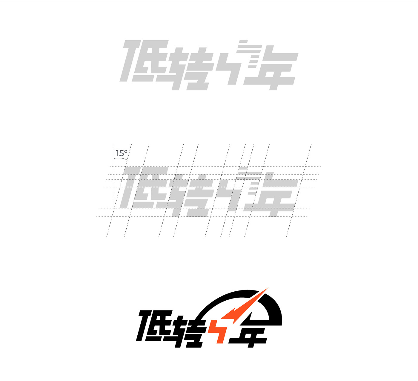

Logo designed for a friend's car review media called "低转中年". "低转" translates to Low RPM, while "中年" means Middle-aged.
Based on the personal brand characteristics extracted from the media videos, I chose stable and bold as direction, using a simple sans-serif font as the foundation from strokes to typography.
To highlight speed, professionalism, and ruggedness, I straightened and modified the curved strokes of the characters “低", "转", and "年", and make them complement each other's structural gaps in strokes.
Then, I gave prominent design to the key character "中"(middle), sacrificing some legibility of the Chinese characters to enhance the recognizability and memorability of the overall logo. Among these four Chinese characters, "中"(middle) best represents the brand's characteristics. The design concept was to make this self-deprecating "Middle-Aged" also a symbol of strength. Therefore, I designed a right-angle bend to resemble a lightning bolt, combined with a tire mark indicating speed.
This shall creates an overall impression of steadiness, professionalism, and distinctive.
为朋友的车评自媒体“低转中年”设计的Logo。"低转"是一种谦逊的自嘲,"中年"代表着踏实与干练。根据从自媒体视频中提取的个人品牌特点,我选择了稳重的粗体为方向,以简洁干练的非衬线黑体为基础进行笔画和字型的设计。
为了突显速度、干练和硬朗的视觉特点,我将“低、转、年”中曲线的笔画拉直变形,显示出它们互相补充的姿态。然后,我对关键的“中”字进行了醒目的设计,牺牲了一些汉字的可辨识度以提高整体Logo的记忆性和辨识度。在这四个汉字中,最能展现品牌特质的就是这个“中”字,设计理念是希望这个自嘲的“中”同时也是一个蕴含力量的象征,因此我设计了一个直角弯成为闪电,结合了一个飞过的轮胎印记。最终使logo整体给人稳重、干练和个性的第一印象。


